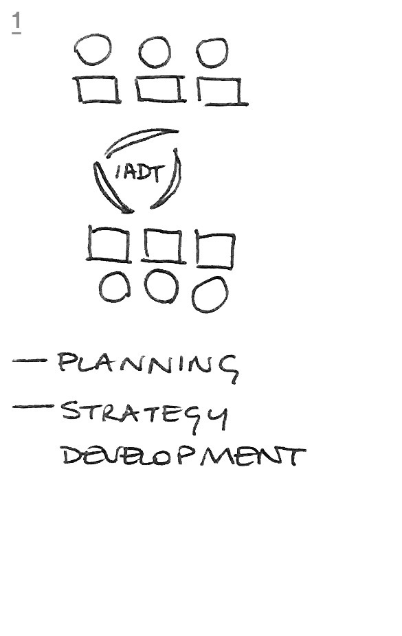
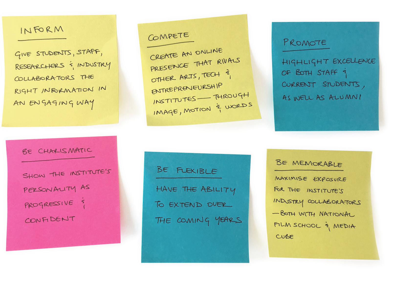
We worked with IADT to plan and design their new website. Our key objectives were to make it function in two key ways:
promotional: encouraging potential students to apply for courses and highlighting the achievements and work of both students and staff;
informational: providing information to students and staff, and works as an information hub for all IADT activities..
...
.
The Team
Creative director: Brian Nolan
Strategist: Aoife Flynn
Project manager: Leonie Henson
Designers: Naoise Ó Conchubhair,
Holly Brennan, Paul McBride
Developers: Tidy
Research, interviews and user testing:
Aoife Flynn and Leonie Henson
.
The Problem
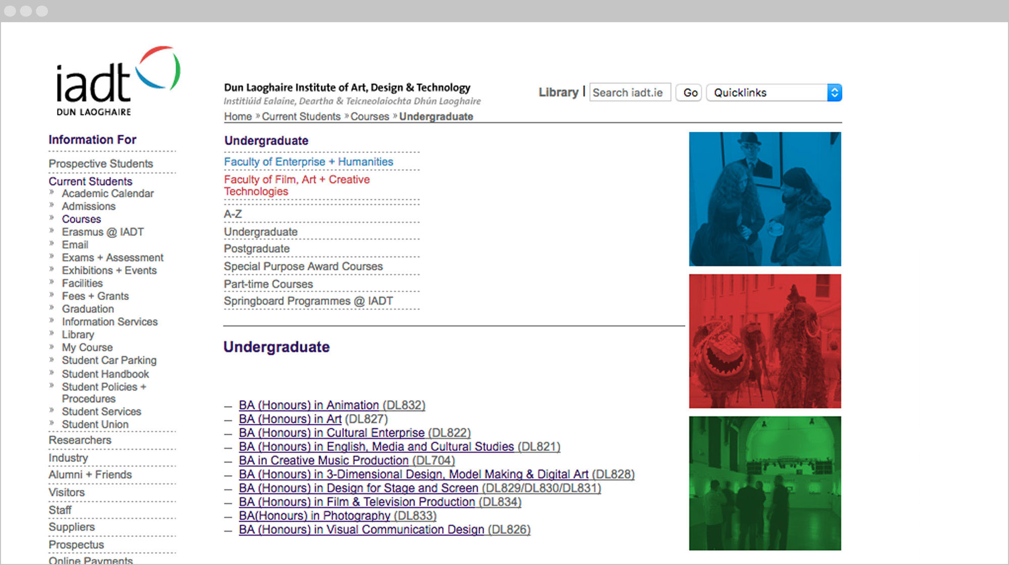
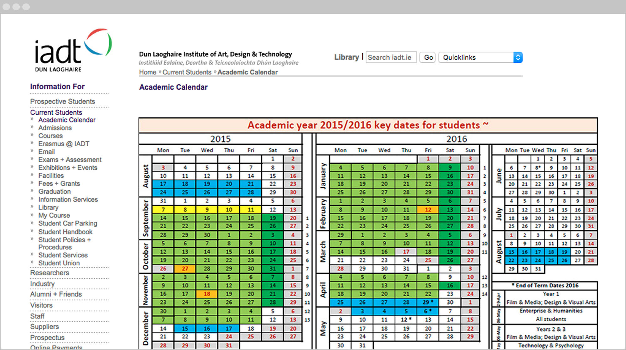
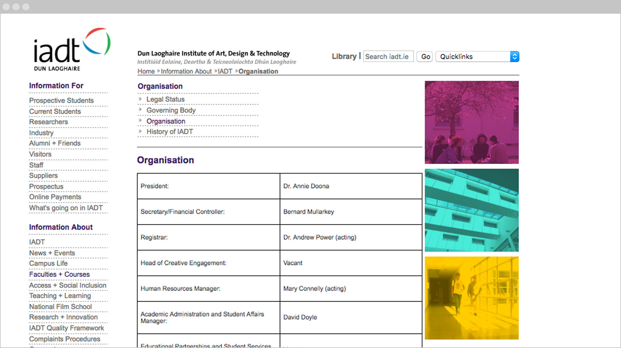
The previous IADT website was over 10 years old, and didn’t showcase any creative or educational aspects of the Institute. Content had accumulated over the years and had spread into multiple department microsites, making the Institute’s online presence difficult to navigate.
The Vision
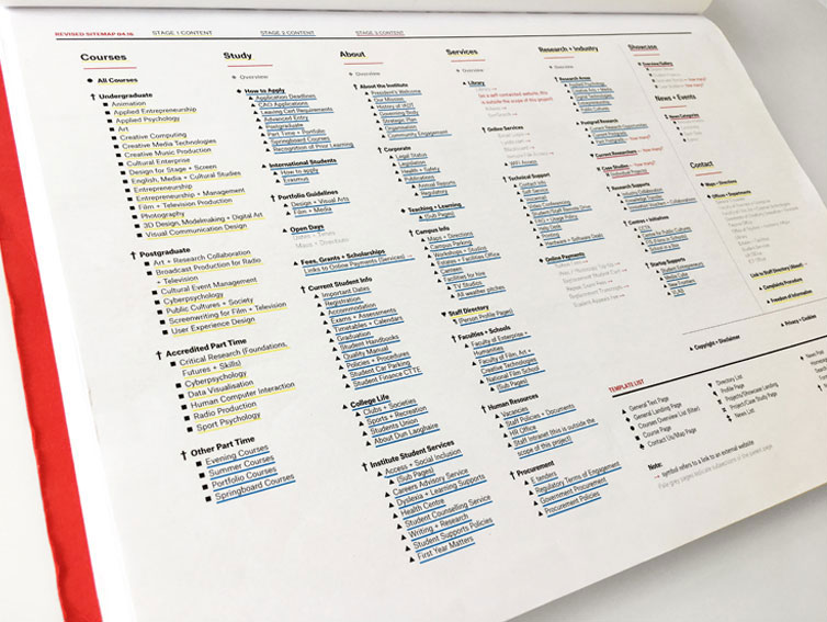
Key deliverables were to understand the target audiences and the specific design challenges; to put in place a system for creating and maintaining high quality content; to refine page structure and content, making it straightforward for visitors to find important information and get drawn into exploring the Institute’s course offerings, amenities and facilities.
The Process
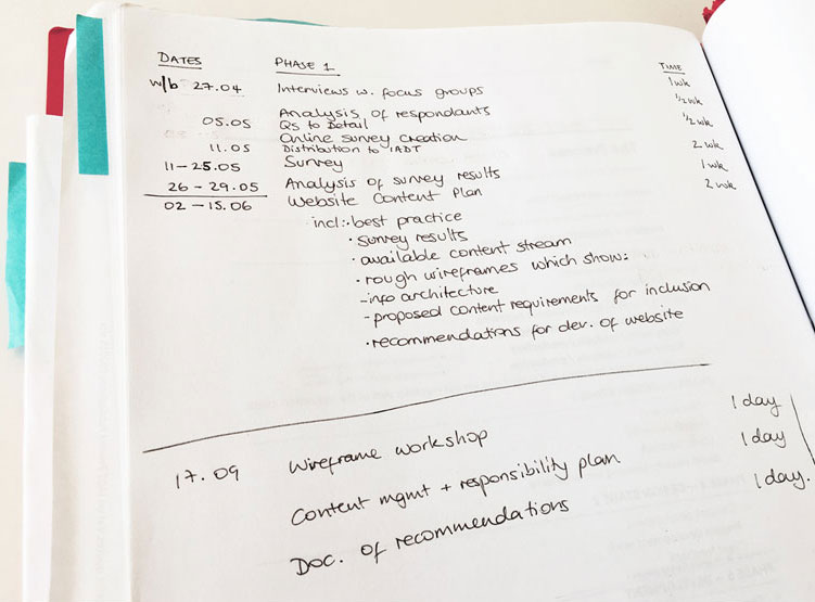
Research
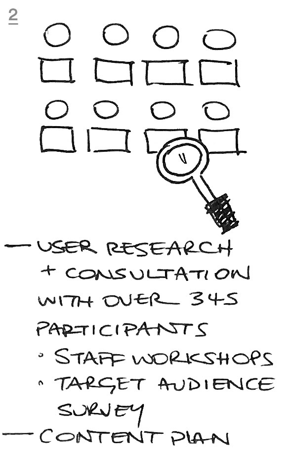
We tested over 345 relevant stakeholders and potential end users of the site at different stages of the design process, to ensure their needs and objectives were met. This research identified the best and most relevant content for inclusion and defined a clear content structure for the website.
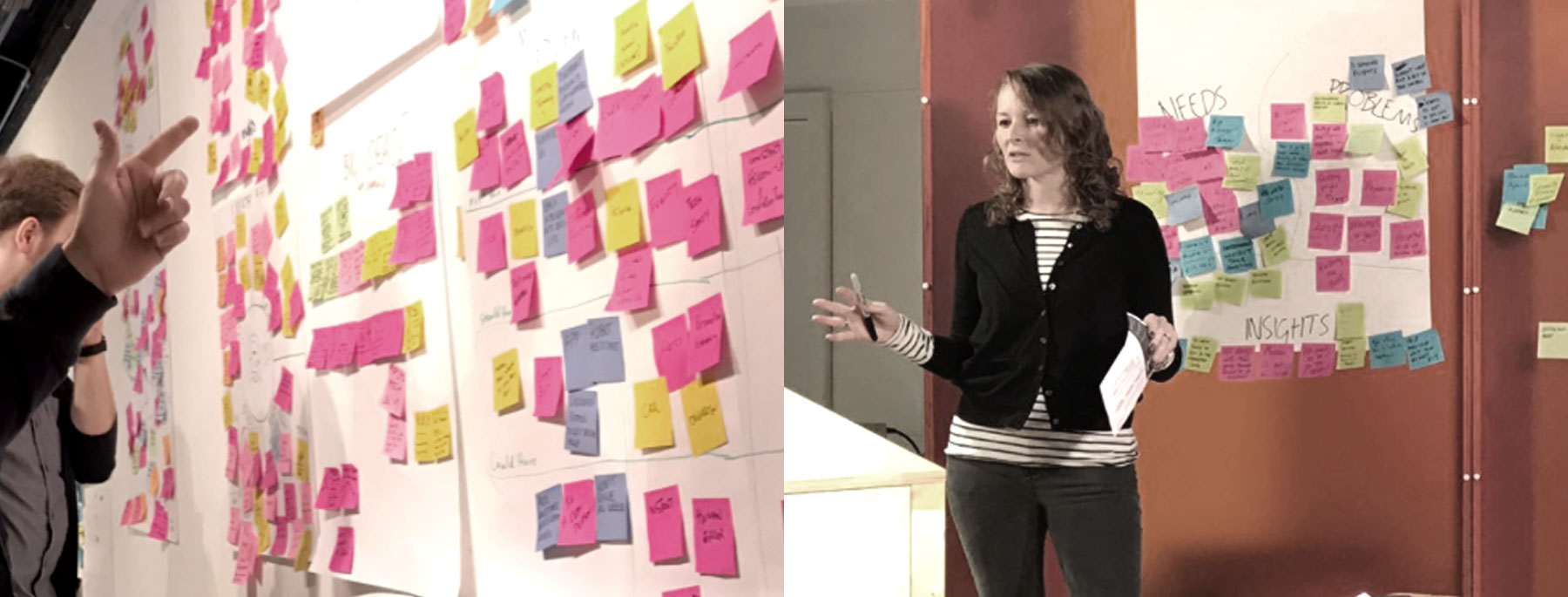
There were over 345 participants in the user research phase through:
competitor analysis
interviews

staff workshops

online survey

focus group

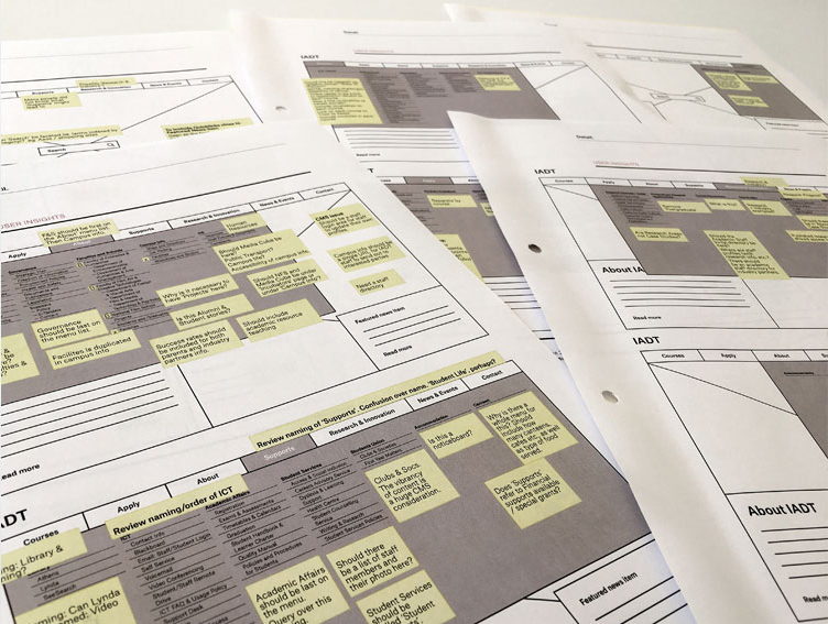
prototype testing
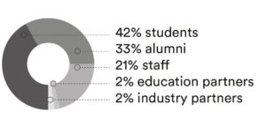
Those who took part:
 .
.
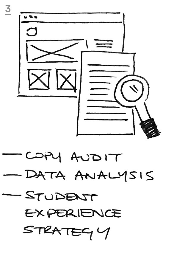
Our research showed that we needed to develop a coherent design strategy which targeted key user groups and to design a refreshed brand position which showed IADT’s unique personality and distinct tone of voice.
Planning
Mapping
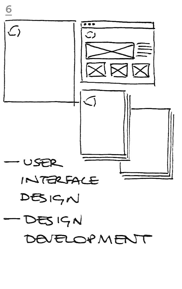
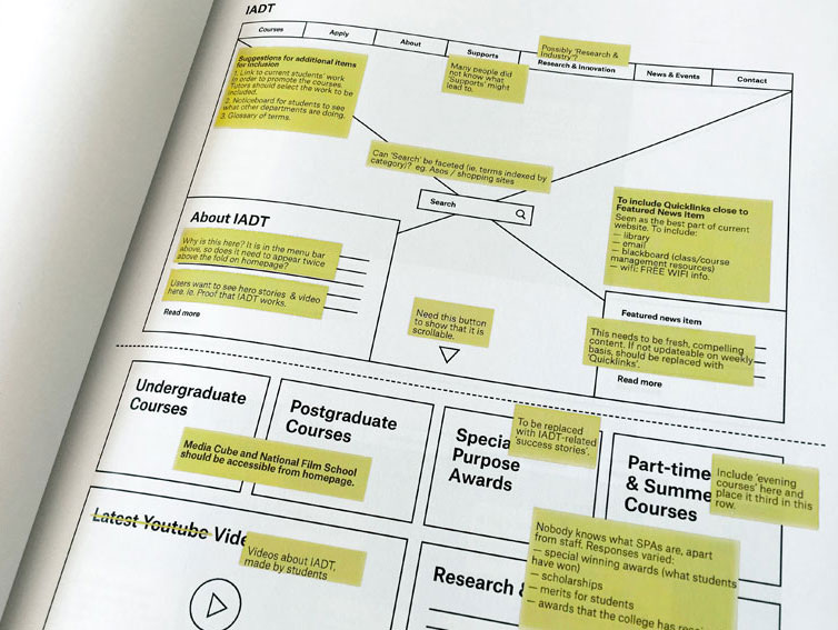
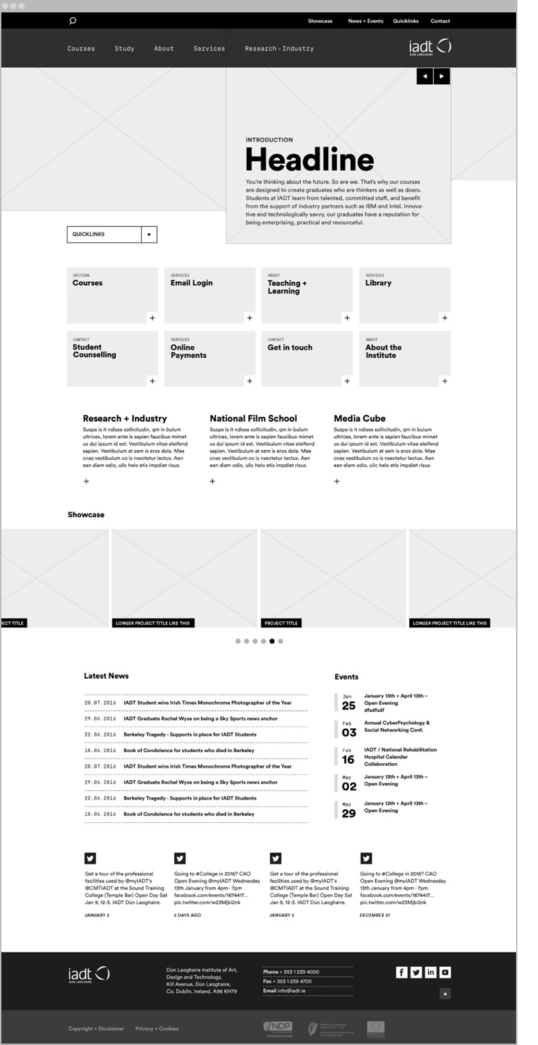
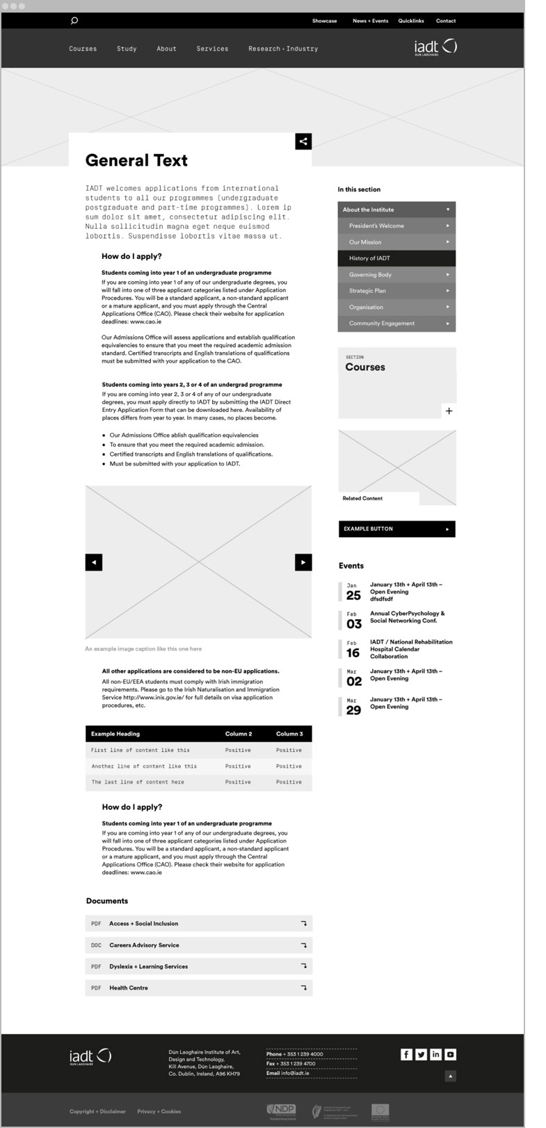
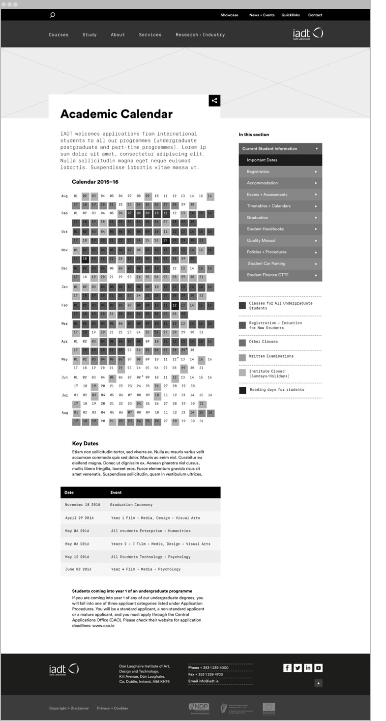
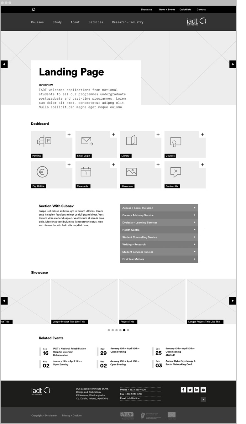
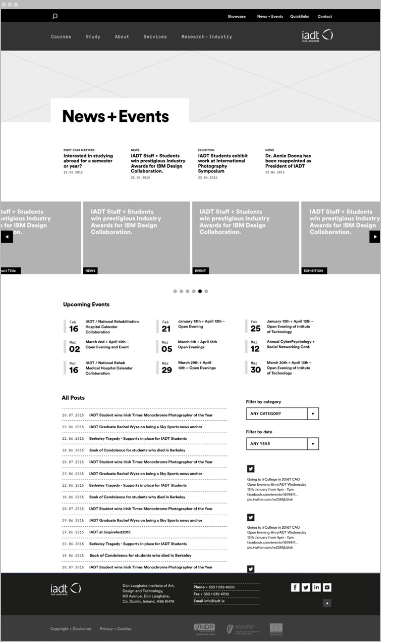
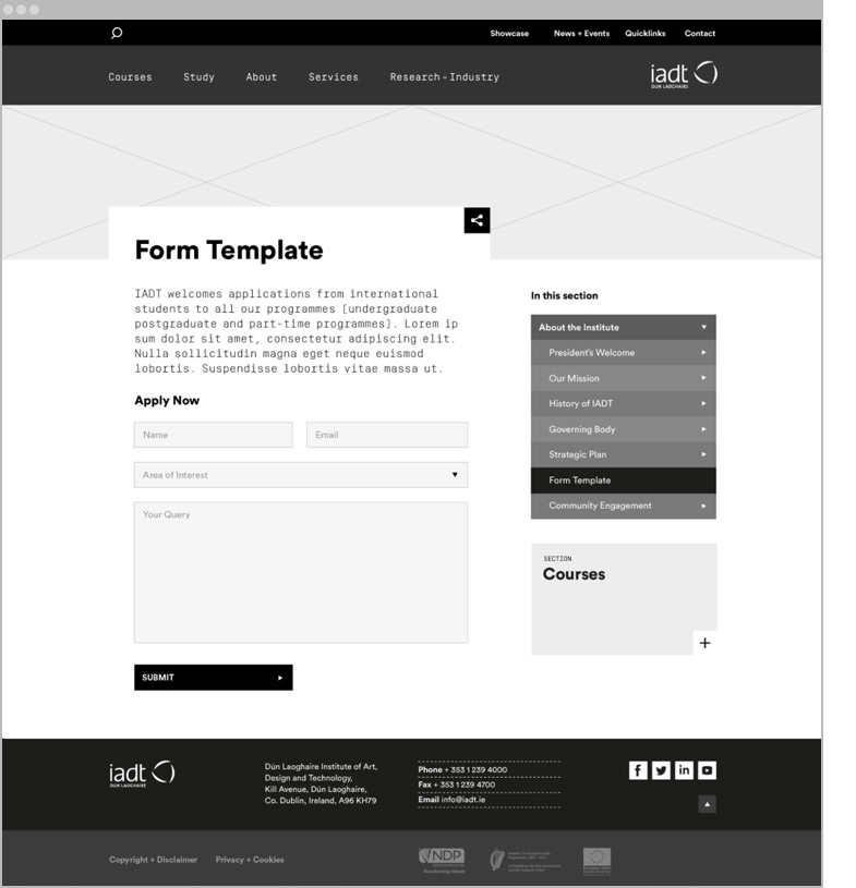
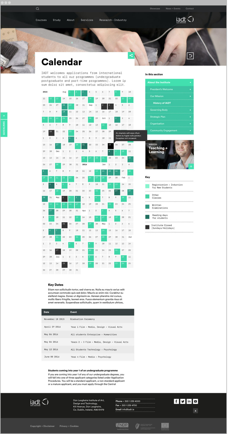
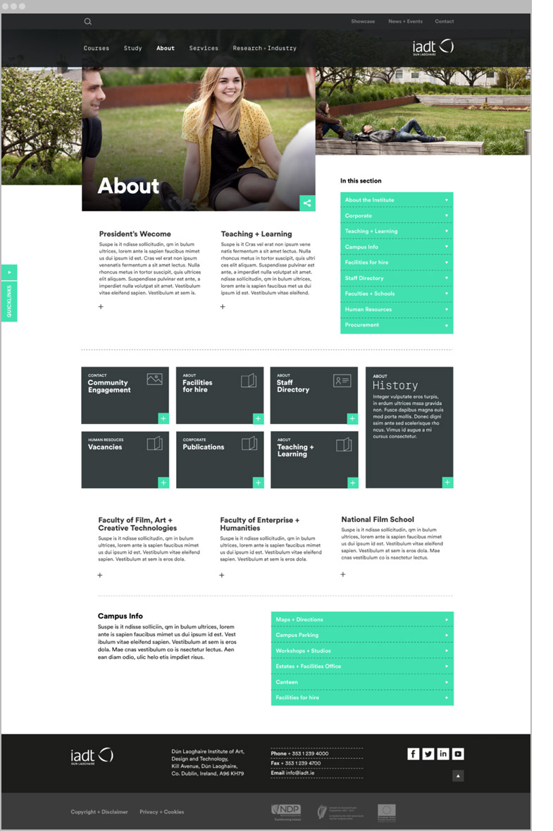
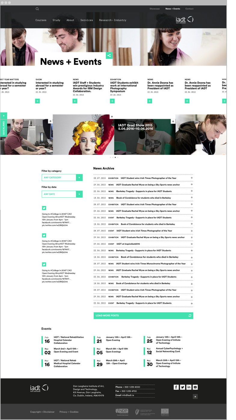
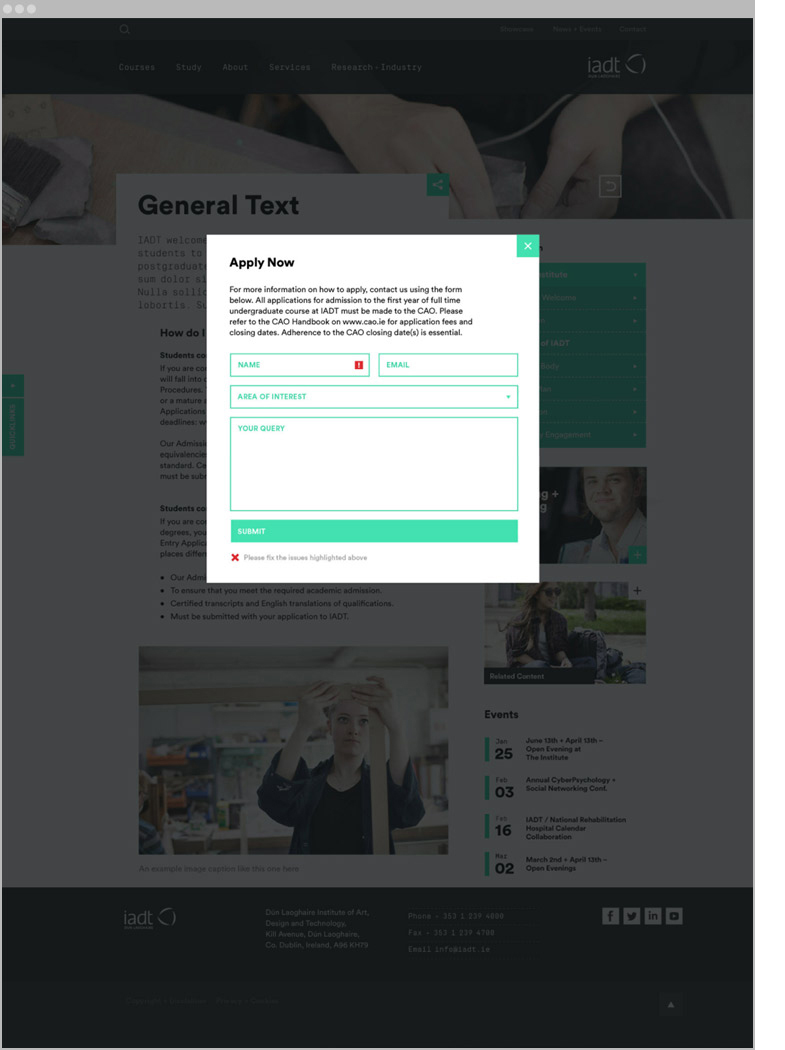
Design: wireframes. More than 15 page templates were designed and user journeys tested, initially with simple wireframes and then a working html prototype. The design has a rigid layout system that brings order and consistency to the content and allows freedom for the asymmetry and level of expression appropriate for a creatively-led institution. Examples:
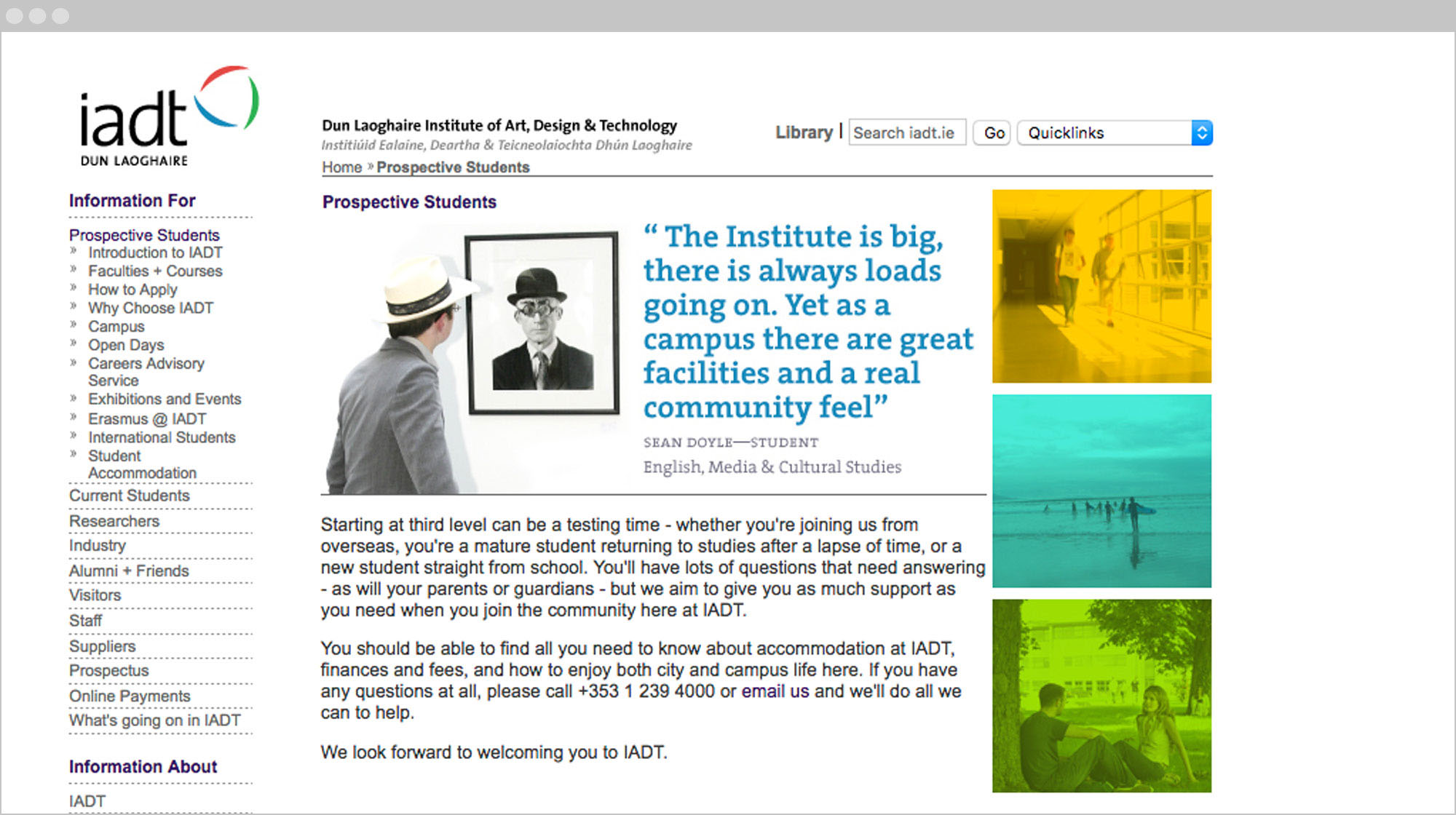
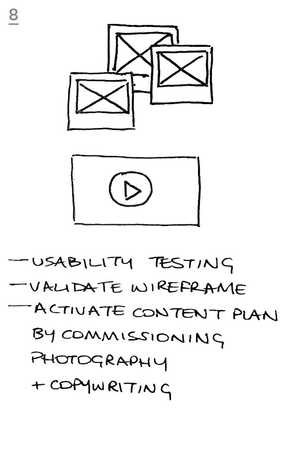
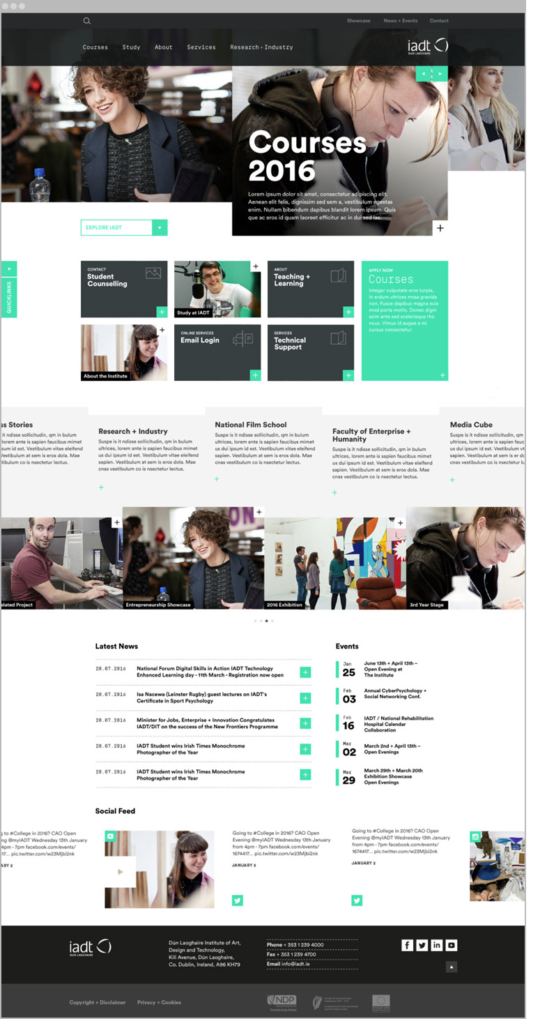
Design: We commissioned photography of IADT students in their class environments, which tell photo stories by presenting multiple shots from the same scene at once, and combined them with observations reflecting college life.
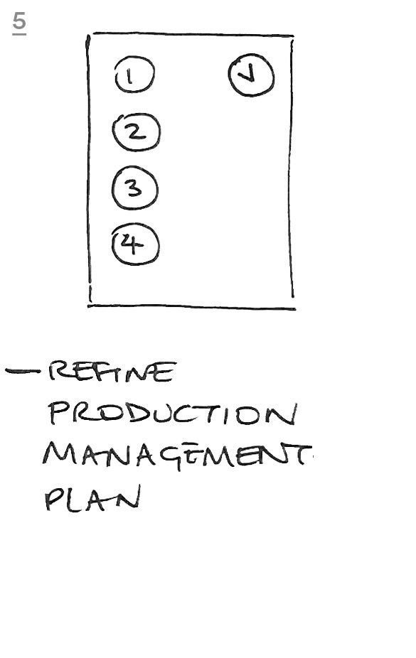
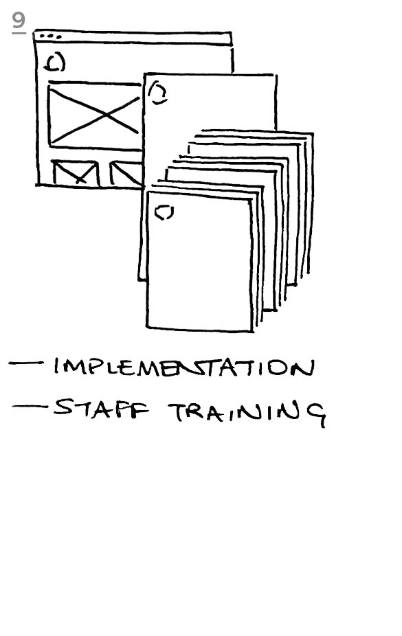
We designed a content management plan and content responsibility plan. The site is integrated with a bespoke content management system and analytics tools. Part of the final development task was to put in place procedures and training for IADT staff to manage and monitor the site themselves.
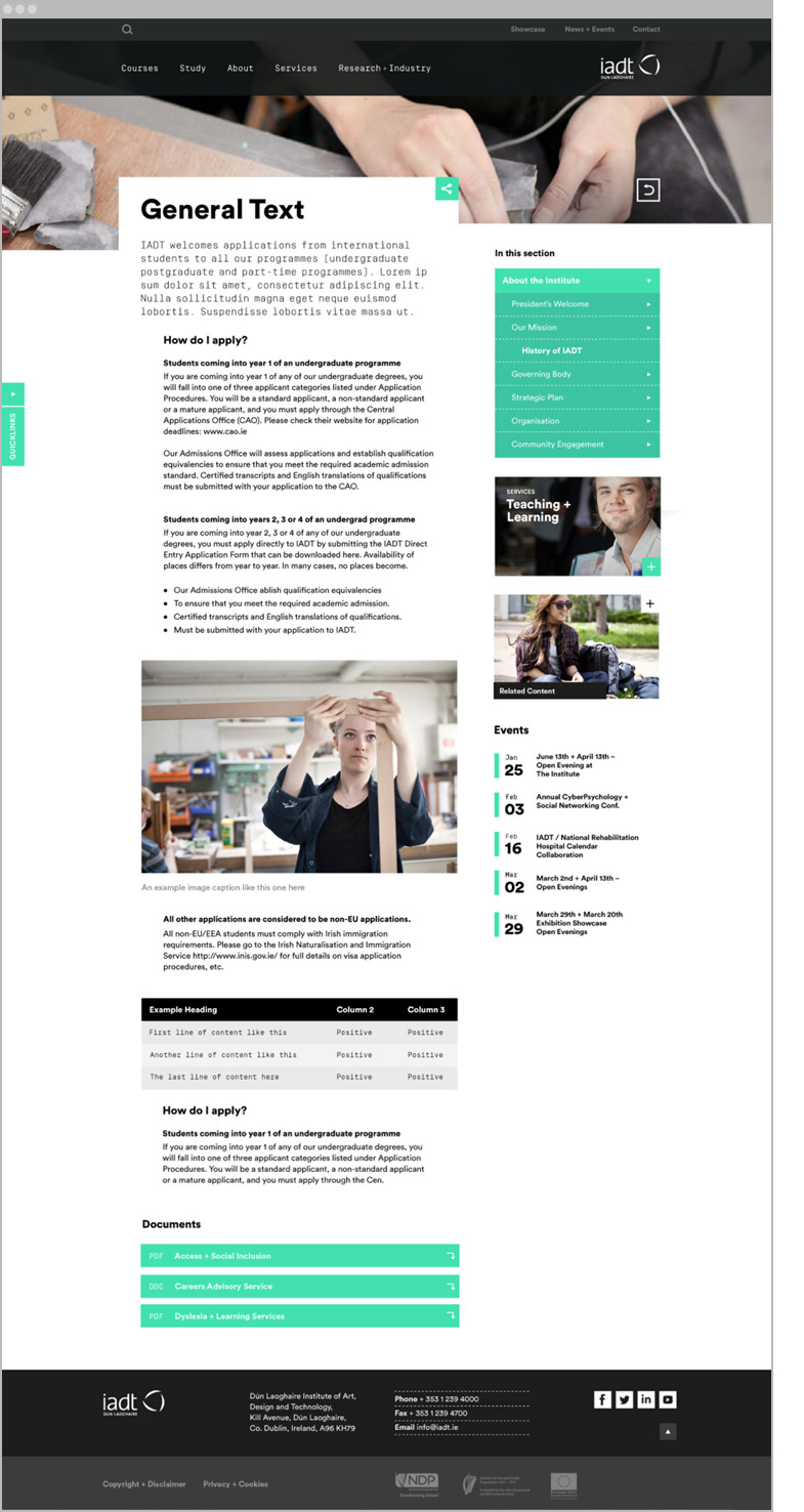
Design: We implemented new rich content—photography and edited copy—into the page templates. This included stories of staff, students, researchers and graduates.
Design: fully responsive mobile site. Particular attention was given to the mobile navigation systems, which was a challenge given volume and depth of content. All content is structured to be within two levels of the homepage.
The Solution
A user-centered scalable response to a communication problem, which needed a holistic and interdisciplinary solution across all platforms of delivery—screen, social media, and was subsequently extended to print and the spatial environment.


